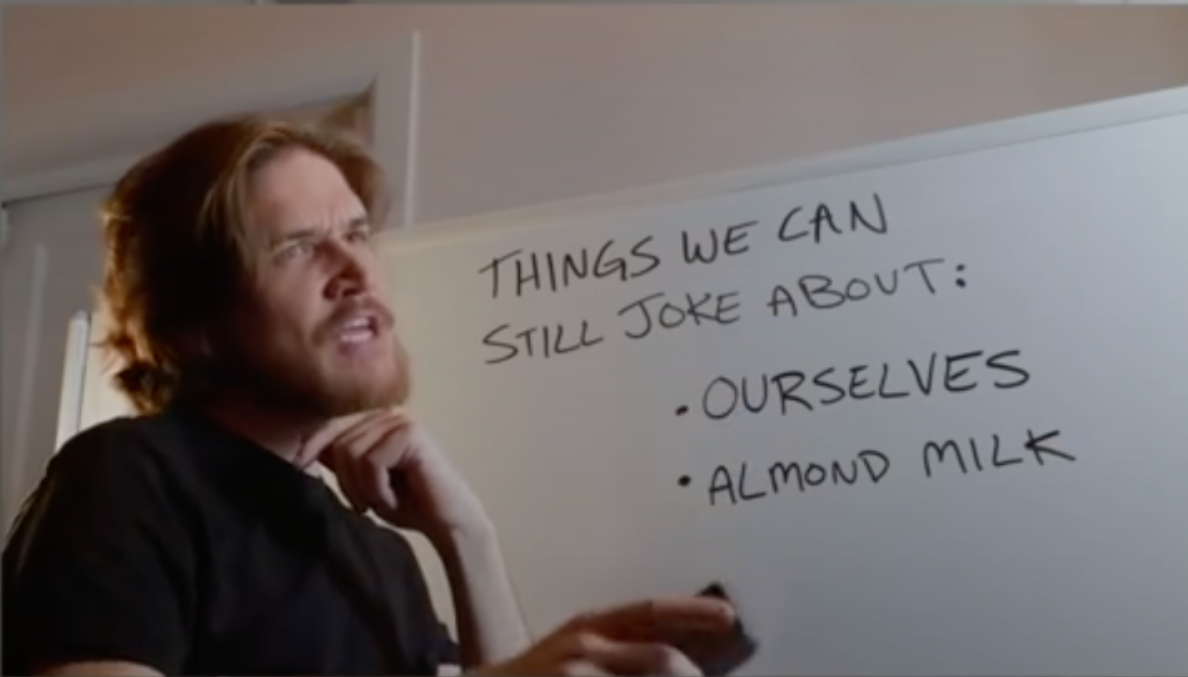
If you can read a few paragraphs of this article without wanting to punch someone, congrats.
I’m so sick of Google…
I mean fuck Google and all, but this is just an announcement that they are copying Firefox’s way of display download information. Is there something inherently wrong with that?
It’s how they are talking in the blog post… You don’t see it?
I mean is this your first time hearing corporate/marketing speech on the internet? I don’t like it myself either, but it is not like it kills children in africa…
*yet
** that we know of
Are you sure this wasn’t written by some poor intern under some form of duress?
“With the download tray, you can see a list of all your downloads from the past 24 hours in any browser window, not just the one in which you originally downloaded a file. The tray also offers in-line options to open the folder a download is in, cancel a download, retry a download should it fail for any reason, and pause/resume downloads.”
Of course it was. Such is the way.
Not first time but Jesus, it’s so awful.
An awful lot of text for “We made a new Downloads UI.”
so they copied Mozilla’s downloads ui? that’s an improvement for chrome imo
I’m gonna call this intentional satire:
It overruns on mobile Safari, too. It’s Ok, I just used the new download feature to download the rest of the sentences.
Did you enjoy your core download journey?
I guess I shouldn’t be surprised if the page looks like shit on Firefox Mobile
don’t worry, it does (I use mull, which is a fork of Firefox for android)
Pro tip, just don’t breath whenever the anger gets worse, you will pass out before you throw up! ;)
deleted by creator
As someone who has geeked out on fonts since we were trading bitmap fonts for System 5 on the Mac, I can say that article is fine. Believe it or not, all of that actually matters to graphic design/text design people.
I got to “crown keeper of communication” and then I had to turn it off. Jesus.
Not a shitpost
true


