Hi Everyone!
Not that there’s anything wrong with the maple leaf, but I feel like we could use a better logo that is a little more lemmy themed.
Any of the more artisticly inclined folks like to help us out with a new logo?

My attempt. I can send a high resolution version if you guys like it.
This is pretty solid, thanks! I’ll give it a bit to see if anyone else has ideas.
I like this. Any new logo definitely needs to keep the Canadian flag in it.
This is excellent :)
I like it.
Accidentally posted form my world account, but I have an account on ca as well.
Can I ask for a minor tweak? On a black background the black outline just disappears, maybe toss a white border around the black to give it some definition on dark themes?
Heyo, didn’t log into world for a while, so didn’t see this. here it is with white outline, both white and red nose.
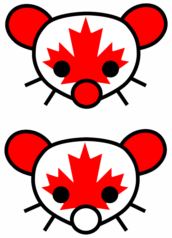
Cheers!
Really nice job. Have you tried making the nose red?

Here is is with a red nose.
I gave Lemmy a toque.

And then I was reminded of Bob and Doug, so…

Fabulous!
Here’s a Lemmy themed logo which is indicative of where the instance is located (that being Canada).

… Who is this?
Am I bad Canadian for not knowing?
It’s Lemmy from Motorhead, who was part of the inspiration for the name of the software:
Where does the name come from?
It was nameless for a long time, but I wanted to keep with the fediverse tradition of naming projects after animals. I was playing that old-school game Lemmings, and Lemmy (from motorhead) had passed away that week, and we held a few polls for names, and I went with that.
Attempt number two. These images came from the OpenClipArt gallery.

reminds me of Shaun the Sheep
I vote to keep the current logo
We could go full lemming: https://openclipart.org/detail/120943/lemming
Looks like a small beaver
it’d ain’t broke, don’t fix it
Can we do something that doesn’t have maple leafs plastered on it please
