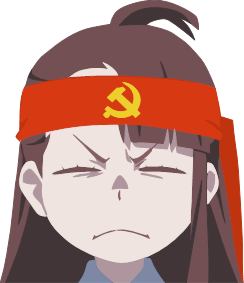
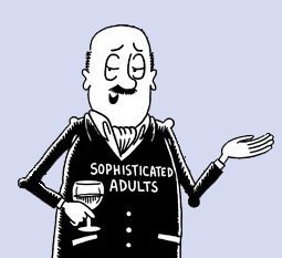
The industry, over time, found what sold the most merch and kept focusing on that, in a copy-of-a-copy practice that Miyazaki warned about. :miyazaki-laugh:
Based on no qualifications, but I’ve taken up drawing as a hobby:
-Bottom has eyelids
-Bottom has more attention given to the nose
-Bottom has lips and a hint of a chin
-Bottom has highlights and shadow in the hair
-Bottom has more proportionate eyebrows
These 5 things give an implication of a form. You probably also don’t like the centralizing focus on Rem’s iris. Rem is probably 5x easier to animate and 10x cheaper if she had to keep a form and be part of sequences up to industry standard https://www.youtube.com/watch?v=E_51cahT1NY (TW: Everything you hate about an*me). I just watched that video. The only shading Rem has is her neck, back of her hair, her maid frills, and under her bust. I have to imagine the woman on bottom either loses 90% of her detail when she fights (see the 1st Valley of the End in Naruto) or doesn’t fight. She’s more picture-esque. I spent roughly 2 minutes watching this one from Jojo’s (another one with which I am unfamiliar) https://www.youtube.com/watch?v=bxwU6sSPpRk . It looks like the shadows don’t move except between key frames, but they have relatively bountiful shading all around the face and body.
In short, watch Jojos and watch One Piece
both are good :shrug-outta-hecks:
Yeah, it’s like showing a screenshot from the 90s Xmen cartoon and one from Adventure Time and lamenting a decline in quality.
Both are just different styles of animation, neither inherently better than the other.


